ExoTracker Issues - Abandoning the grid
This site has moved!Trackers have decades of design, with interlocking features and design decisions, many based on the assumption that every event is quantized on a grid:
- You don’t need lines above events, since it’s obvious which row the event is in.
- In regular trackers, events are treated as taking up height. Most events are triggered when the cursor enters them, but pattern-jump effects are triggered when the cursor exits them.
- Empty grid cells have dashes in them, to indicate an empty slot belonging to a subcolumn (note/instrument/volume/effect…) and row. (I refer to channels as columns, for historical reasons and because Renoise uses the same terminology.)
ExoTracker’s central feature is that events/notes no longer have to be quantized to a grid, but are stored as rational numbers (fractions) in terms of “beats”. Events are mapped onto rows using a zoom level (rows per beat), and changing the zoom level causes notes to fall onto or off gridlines.
(tl;dr: Skip forwards to “Per-digit cursors” where the problems start.)
As a result, many tracker conventions must be adapted to work with off-grid notes.
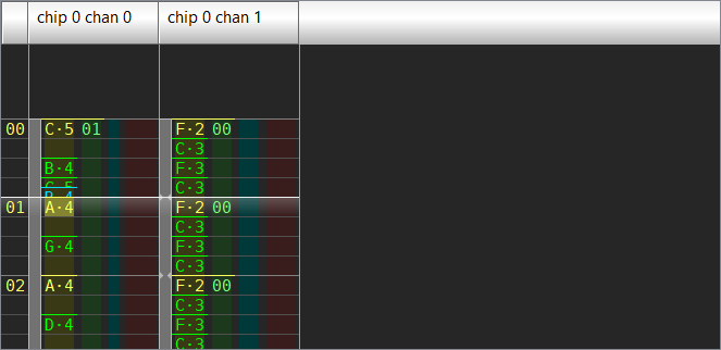
- Closely spaced notes/events can cause text to draw over other text. I programmed lower events to erase the text drawn by upper events.
- The “events have height” model breaks down when off-grid events exist and you can change the zoom level. So I draw a line above every note, representing the instant in time the event occurs at (which I find easier to reason about than 1-row-tall events).
- Initially, for each event, I drew a line across all subcolumns (even empty ones), but that became confusing when combined with closely spaced events erasing text in only occupied subcolumns (not empty ones).
- So now only occupied subcolumns have lines.
- Pressing Delete 4 times will no longer delete all notes in the next 4 rows, because it won’t erase events between rows.
- I felt that the alternative, where pressing Delete also deletes notes in between rows, would be more confusing and inflexible for users.
- So I made “cursor step” both snap to the grid and off-grid notes… which is actually rather janky and surprising.
- The issue is that my code snaps to all events in the channel, not just events with a non-empty value in the cursor X position’s subcolumn. Changing this would complicate the code.
- To alleviate this, I turned off off-grid event snapping, and added a mode where pressing Delete (or entering a value) steps to the next event, regardless of the cursor’s X subcolumn. This is useful for deleting many events, adding or changing instruments, etc.
- Trackers usually have gaps between note/event/volume/effect, so I add padding around each subcolumn.
- If empty grid cells are drawn with dashes, then on-grid notes will erase the dash. But it’s not clear if off-grid or triplet notes should erase the dashes or not. I chose to replace dashes with horizontal gridlines. But they don’t indicate subcolumns, so I add colored backgrounds.
- One alternative would be to draw dashes before drawing events, and simply erase dashes whenever text overlaps them. This looks fine with on-grid events, but with off-grid events, you can end up with partial dashes which might look a bit ugly.
- In retrospect, this was probably a better idea, since colored backgrounds proved to be a disaster.
- One alternative would be to draw dashes before drawing events, and simply erase dashes whenever text overlaps them. This looks fine with on-grid events, but with off-grid events, you can end up with partial dashes which might look a bit ugly.
Per-digit cursors
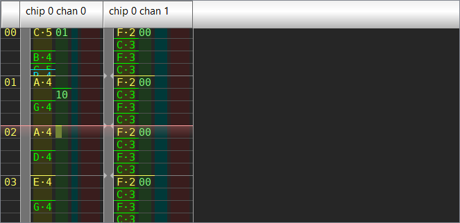
Everything was more-or-less working, until I added per-digit cursors and the setup broke down. Suddenly the cursor width became highly inconsistent; the cursor is wider when you place it in the leftmost or rightmost digit of a subcolumn.
So I can make the cursor narrower… now there’s a gap around the cursor. And several people have said the gap looks very weird, so this isn’t a good solution.
This is actually what FamiTracker does too, but it doesn’t look ugly because there aren’t background stripes.
So do I make the stripes narrower?
Get rid of the dividers too?
So I can make them the same width… but then either the note lines overlap, or they have gaps, or the widths are inconsistent. This will cause problems with mouse handling as well.
A solution?
At this point, I feel that background stripes to indicate subcolumn boundaries, and cursors which occupy digits within a multi-digit subcolumn, are simply incompatible.
If I want to keep that latter feature, I could remove background stripes and replace them with dashes, which are erased whenever text overlaps them. This looks fine with on-grid events, but with off-grid events, you can end up with partial dashes which might look a bit ugly.